Profflex - labels for a new line of adhesives

Profflex is a manufacturer of adhesives, polyurethane foams, and sealants, operating in the Russian market. The products the company offers are in the lower price range.

Services:

Art direction
Label design

What did the client need?

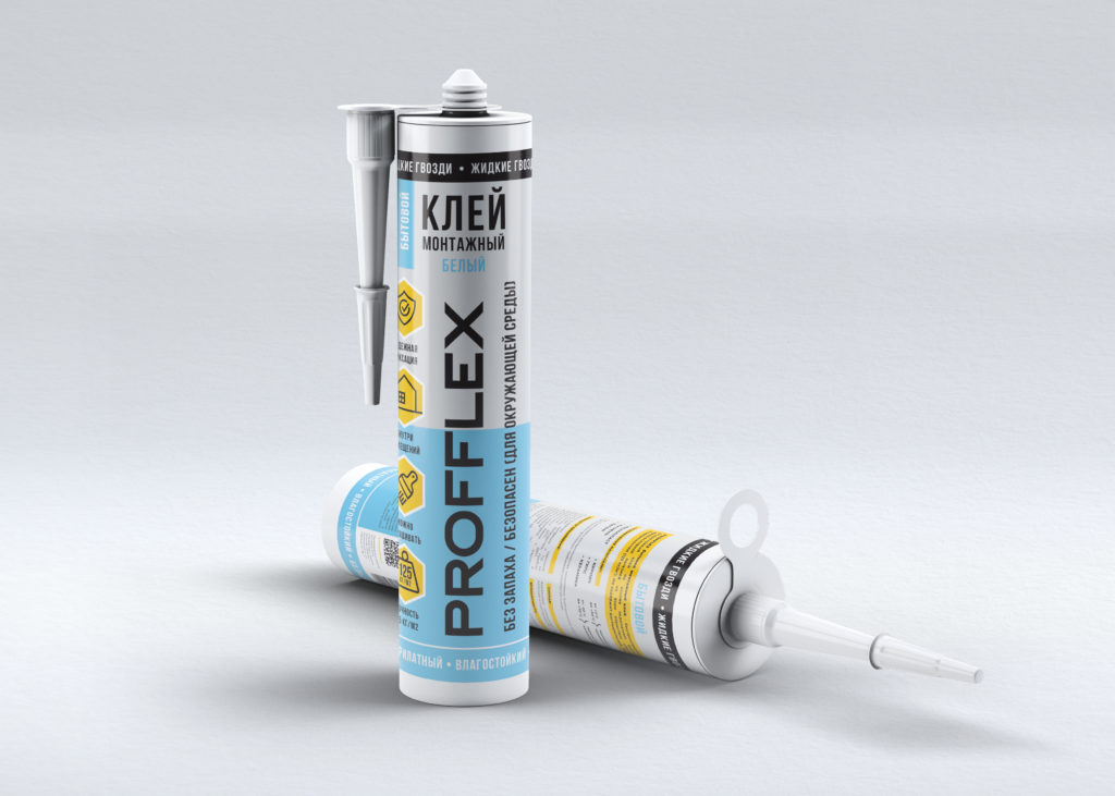
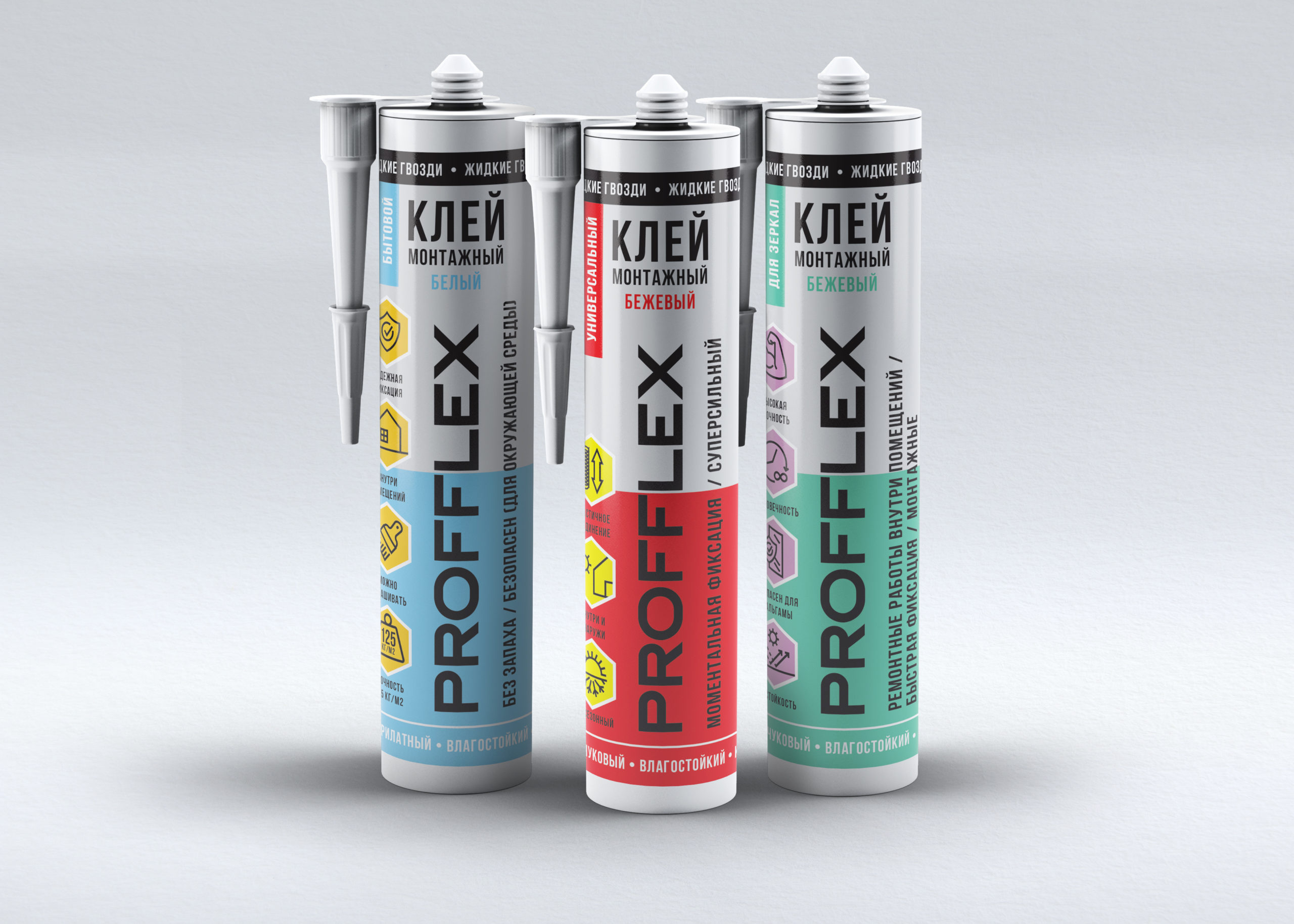
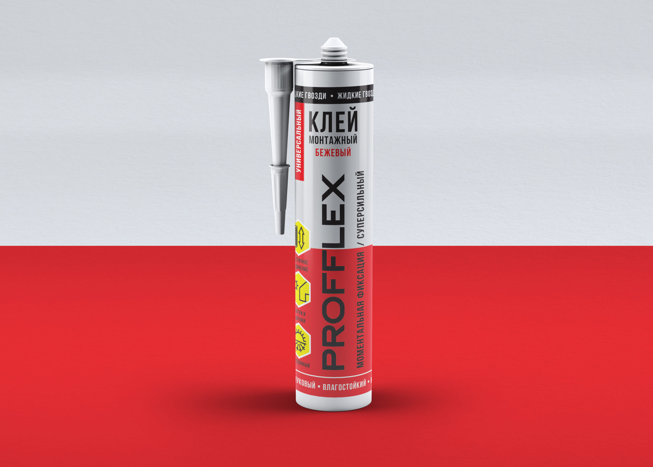
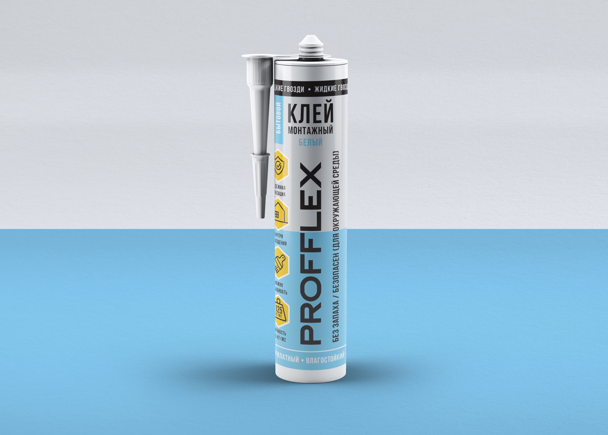
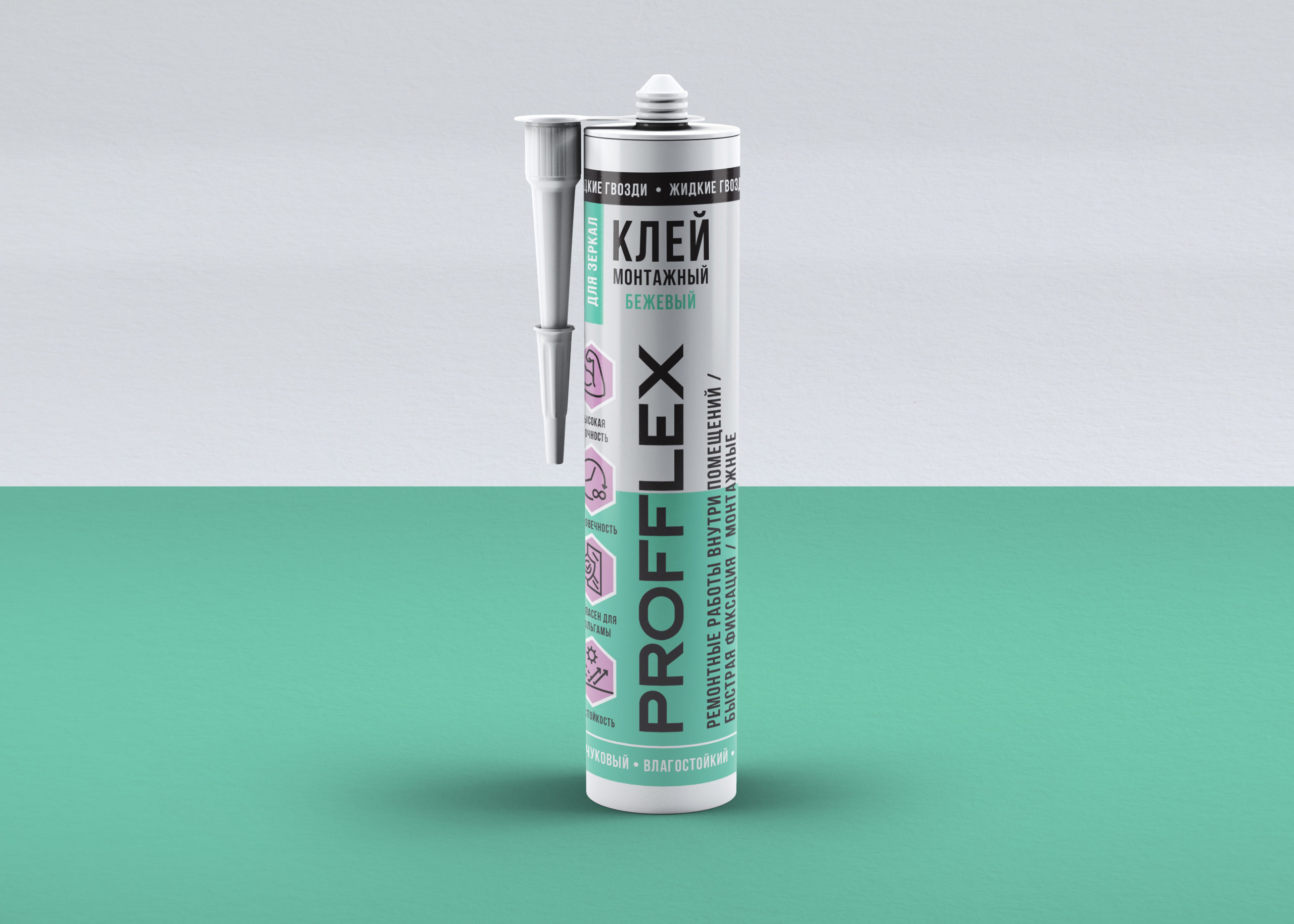
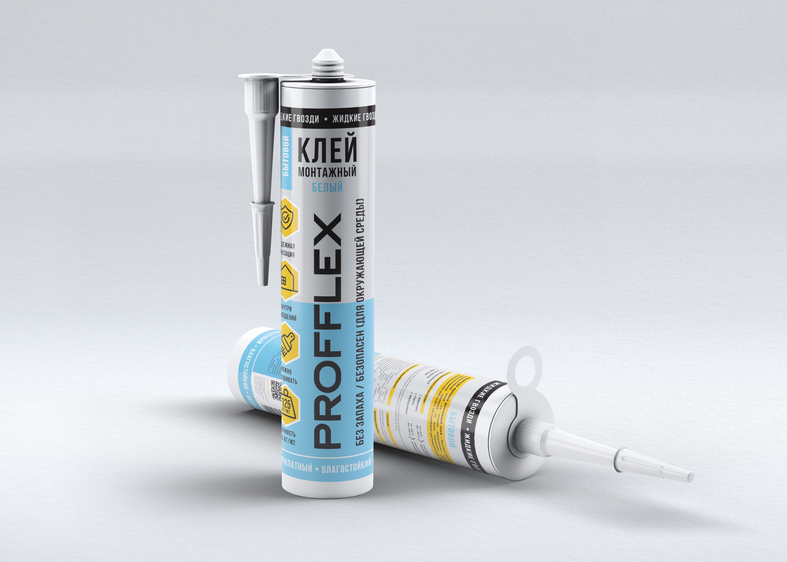
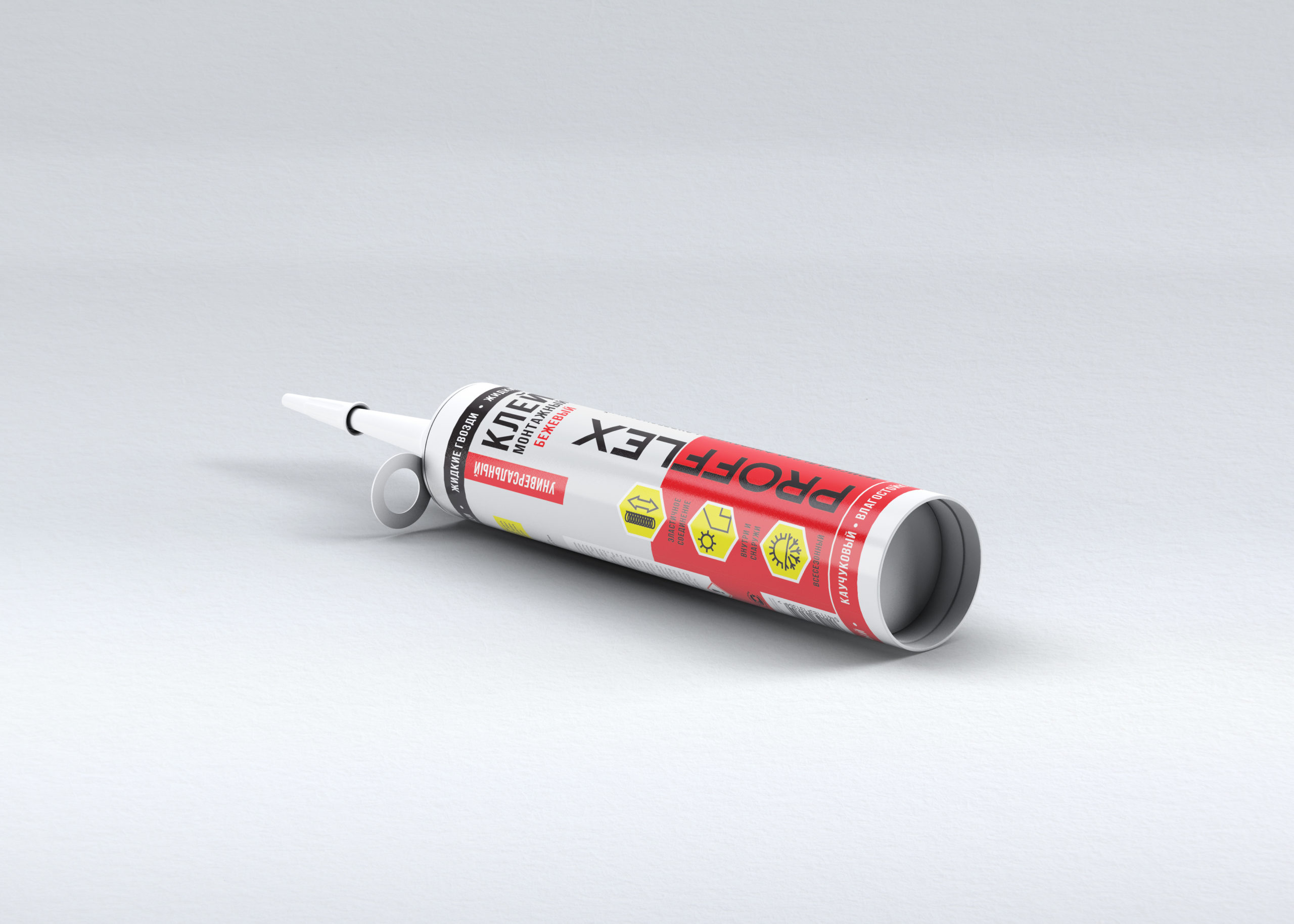
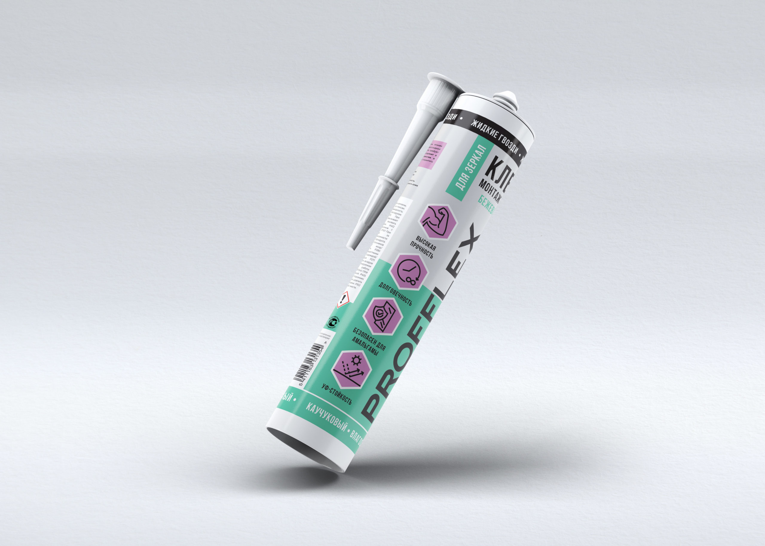
The client needed a design for a new line of products, which was about to enter the market. The company’s existing packaging draws attention because of the intense colors featured, but is overloaded with effects and information. The labels for the new product line were to be more modern, but still feature eye-catching colors.

What did my job involve?

My job was to choose the right visual means to make the design meet the client’s new goals. I kept the design uncomplicated and uncluttered by picking simple shapes and modern typography. I decided to limit the color palette to black, white, and two stronger colors assigned to each product in the line. All the colors in the line make up a consistent palette. Cutting the color off in the middle of the label keeps it from being overwhelming. This also makes the products more noticeable on the store shelf.

Let’s create a unique image of your company

Does your company also need good design to take the next step forward? Let’s talk!