hy:biome – skincare
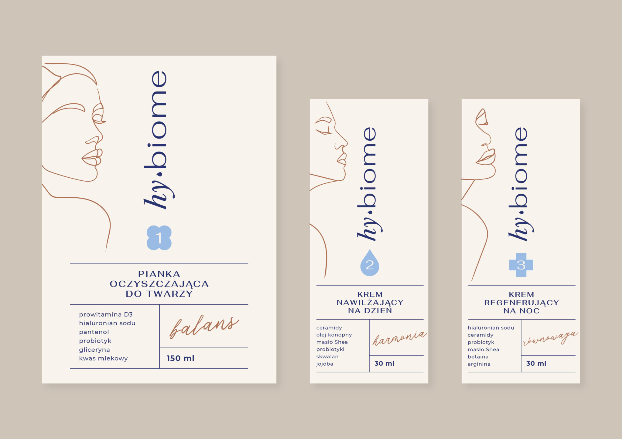
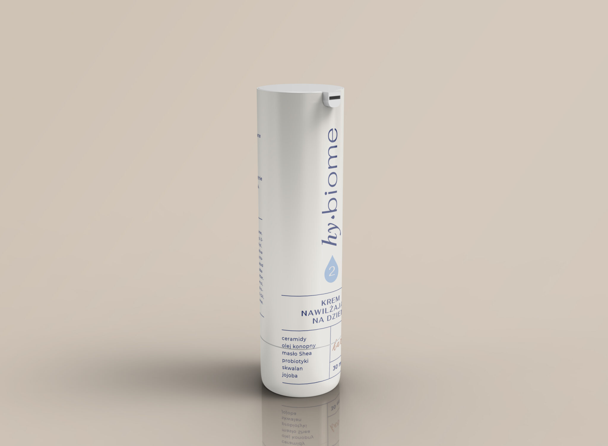
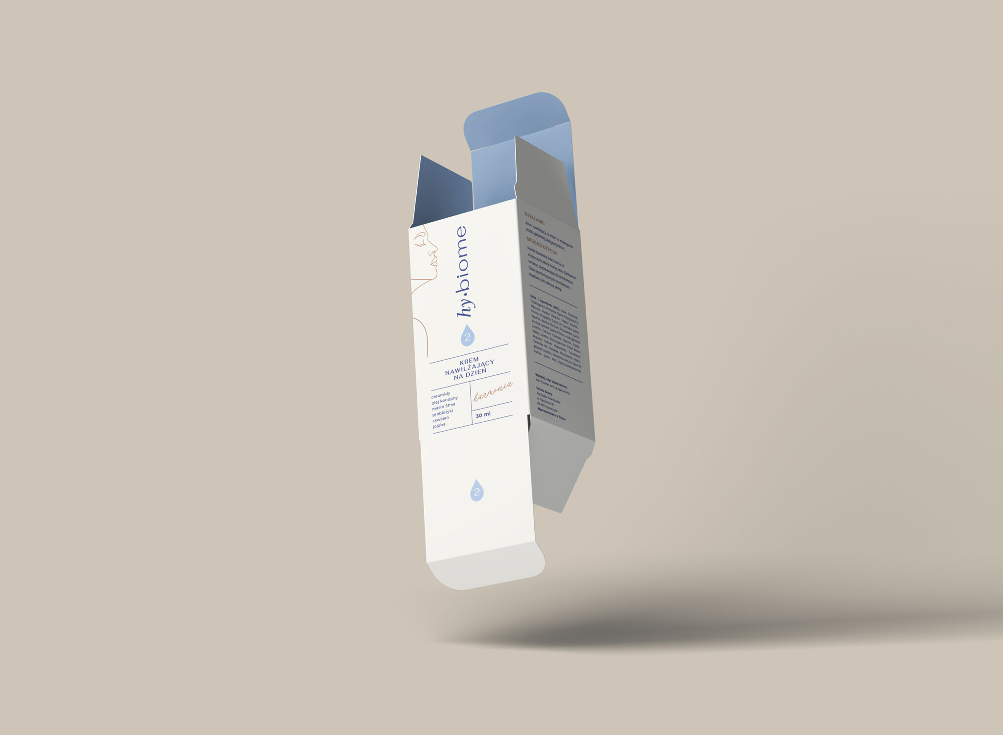
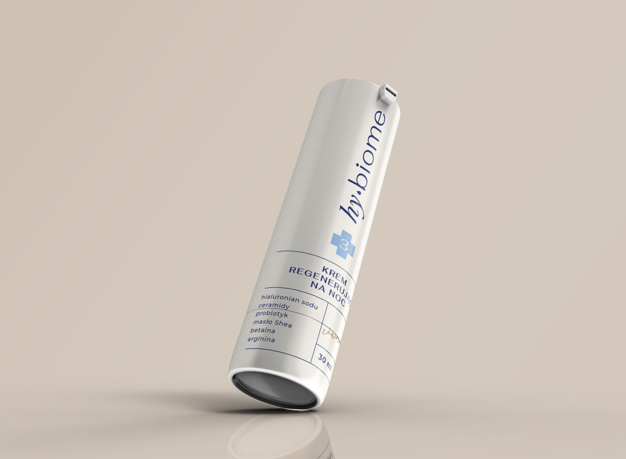
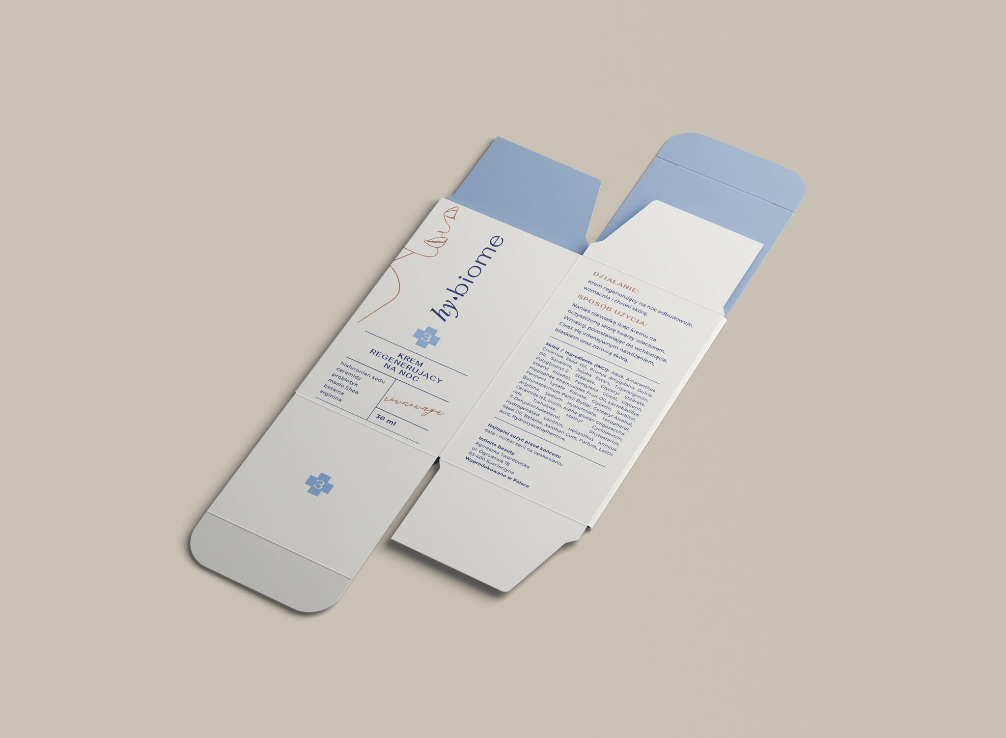
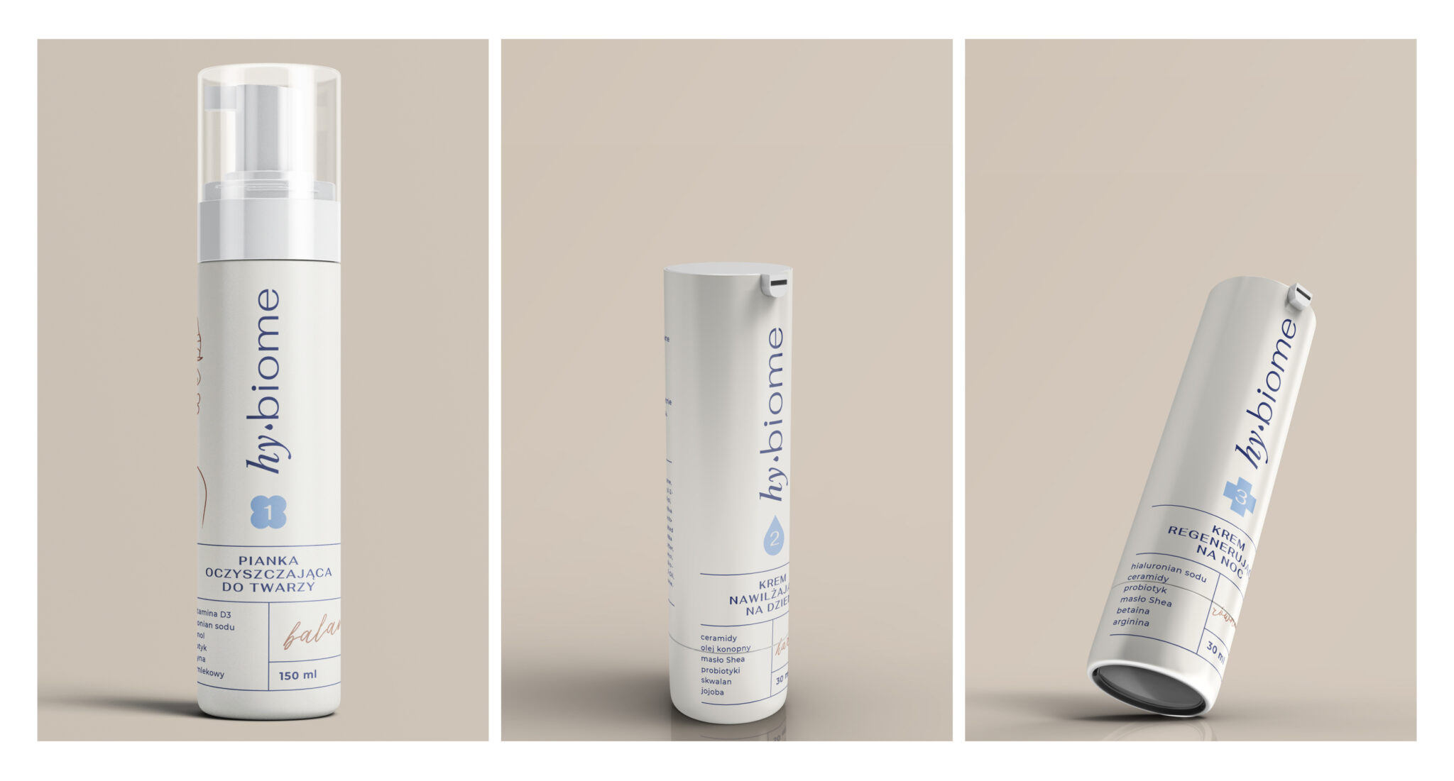
In response to the needs of modern skincare, my client has developed her own proprietary line of three skincare essentials, designed to replenish the skin’s hydrolipid barrier and adapt to individual skin types. Comprising a cleansing foam, a day cream, and a night cream, each formulation is imbued with the care needed to maintain the skin’s natural microbiome balance.
Services:
Naming
Logo design
Packaging design
What did the client need?
What did my job involve?
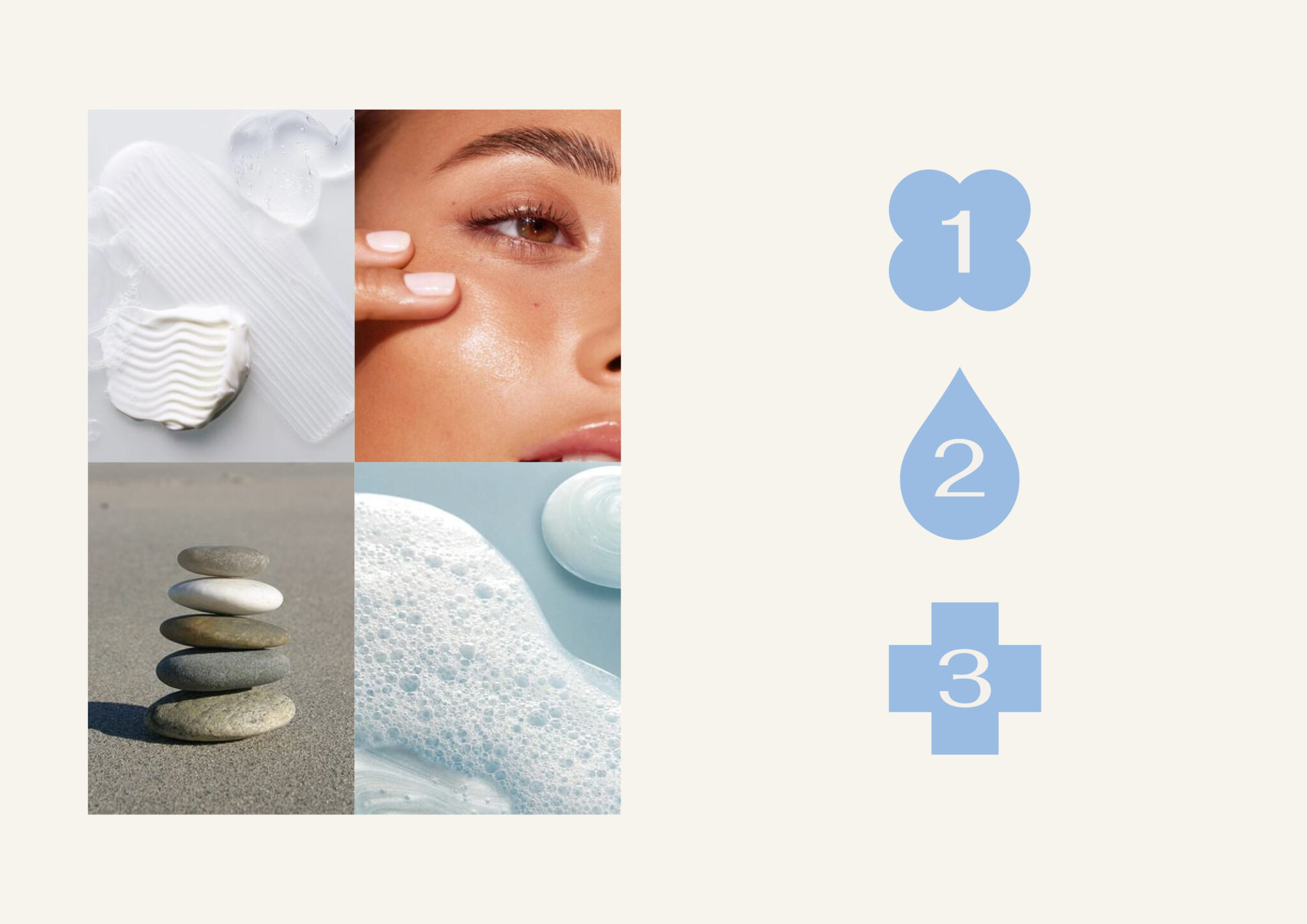
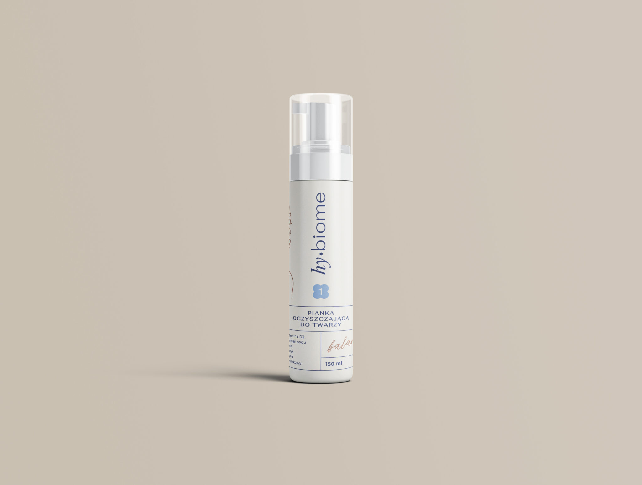
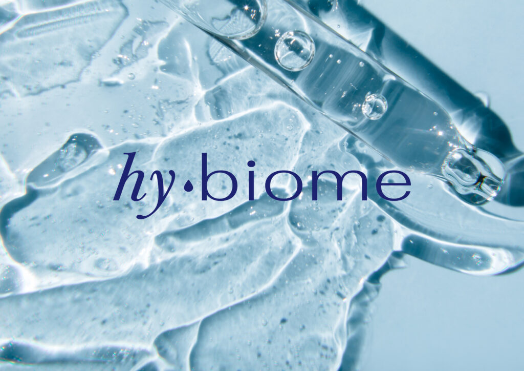
In collaboration with a copywriter, I proposed several brand names for the cosmetics line, from which “hy:biome” was selected after revisions. The prefix “hy” alludes to both hydration and the hygge ethos. Each skincare step was represented by a simple icon paired with a numeral, accompanied by its designated name: Balance, Harmony, and Equilibrium. The packaging design was inspired by these principles and the color palette associated with skincare – cream white, water blue, and skin-tone beige. The cosmetics packaging was designed to reflect sophistication and functionality, resonating with the discerning tastes of the target audience.

